Thursday, October 29, 2015

The Poblenou Cemetery in Barcelona

Why would I even think of exploring the Poblenou cemetery?  Because of the architecture, sculptures, the many works of art and one particular grave site which you will read about further into my post.  It's a peek into Barcelona's past and culture.
Also known as the Old or Eastern Cemetery, it was created in 1775 due to poor sanitary conditions within the old walled city.  It was founded by the Bishop of Barcelona Josep Climet i Avinent.
The first cemetery was later destroyed by Napoleon's troops in 1813.  It was re-built by a young Italian architect, Antonio Ginesi and consecrated by Bishop Sitjar in April of 1819.
The new part of the cemetery took on an orderly, neoclassical look with the first section with its rather dignified terraces of burial niches.  The back section created by Joan Nolla is filled with mausoleums, sculptures and monuments created for the wealthy bourgeoisie, merchants and manufacturers of Barcelona.  It was an ideal way to show off their opulence and social prestige.
I found it very interesting looking into these peoples lives from how there markers had been decorated with flowers, photos and personal mementos.
There is a map at the entrance of the cemetery with a walking route highlighting over 30 graves.
I felt a sense of peacefulness and tranquility.  Not a sad place but one of remembrance. 
We spoke with a middle aged man that was freshening up his mothers tomb.  He was very proud of what he had done and was very appreciative of my complimentary comments.  He had been way up on a rolling stairs type ladder that you will find in every aisle.
I was intrigued by this type face that was typical of Modernism, the 19th century Art Nouveau movement that emphasized natural forms, bright colors and curveular lines.
The cemetery is home to many famous Catalans such as composer Josep Anselm Clave, play wright and poet Serafi Pitarra and the Malda family.
It was this white marble sculpture that original peaked my interesting in visiting the Poblenou.  El Beso de la Muerte - The Kiss of Death.  This is the grave of textile manufacturer, Joseph Llaudet.  It was designed by Joan Fontbernat and sculpted by the Jaume Barba's taller in 1930. 
It was intriguing and unsettling at the same time.  Is it a look of seduction or resignation?
Llaudet's marker read, "His young heart is thus extinguished.  The blood in his veins grows cold.  All his strength has gone.  Faith has been extolled by his fall into the arms of death. Amen."
Some of the sculptures are very realistic.  Talk about totally different than the last marker, is this man standing proudly with a packet of cigarettes in his left pocket, sunglasses hanging from the opening of his shirt and a bottle of liquor (it looks like Jack Daniels) in his right hand.  He obviously enjoyed life.
Does this cat live at the cemetery or is he part of the Familia Roca Ferrer?
Above is the sculpture of the "Santet" or little saint.  Frances Canals i Ambros was a young man of 22 years of age when he lost his life trying to extinguish a neighbor's home fire in 1899.  He was well known for his selfless acts and having some supernatural powers.  To this day, people still leave photos, letters and flowers around his tomb.
It was a week day and there were many visiting their loved ones tomb with a bucket of cleaning supplies, flowers and other offerings.
I always find cemeteries interesting and this one is a must if you have an open morning in Barcelona.   

Poblenou Cemetery
Located in the Poblenou neighborhood in Barcelona
Located on Calle Taulat with the main entrance at Avenida Icaria.

Friday, October 23, 2015

Sant Pau, an Art Nouveau site not to be missed in Barcelona

Walking up Avenue Gaudi from the Sagrada Familia, you come to the Hospital de La Santa Creu i San Pau.  An Art Nouveau site that opened up last year after four years of refurbishment.
Built between 1902 and 1930, the Sant Pau is an outstanding example of Catalan Modernisme.  It was declared a World Heritage Site by UNESCO in 1997.  
The Eixemple (meaning enlargement) is an area near by that was designed for the growing population in Barcelona. Large scale improvements to the city were made by extending the city limits into the surrounding neighborhoods to the north.  This grind pattern paved the way for some of Barcelona’s distinctive 20th century architecture with its wide streets w/ shaved corners.
Architect Lluis Domenech i Montaner built a hospital complex with its own urban layout at 45% angle.  As you see in the model above, it is a "city within the city".   He was allocated a site that was equivalent to nine Eixample blocks which included lavishly landscaped grounds.  
The site has symbolic connotations.  The ground plan was designed on two axes, one vertical and the other horizontal, which together from a cross. 
Montaner built separate pavilions, each designated with a specific medical specialty and were connected by underground pedestrian tunnels.  It was kinda spooky seeing these moving images that were projected on the walls.  This little girl was having fun interacting with them.
Montaner worked on the construction until his death in 1923.  Then his son, Pere Domenech i Roura, took over the project.
Other beautiful works of Montaner were the Palau de la Musica (a post I wrote about on September 25, 2015) and the Institute Mental Pere Mata in Reus which inspired him to implement the "garden city" in this project. 
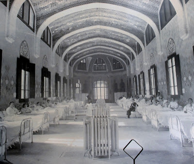
The Sant Rafael pavilion was built between 1914 and 1918.  It was the trauma department that held 44 beds. 
This pavilion is different than the others for it is decorated with the letter "R" in honor of Rafael Rabell and his daughter, Concepio Romaguera, who were responsible for paying for its construction.
This pavilion has not been restored, only partitions were removed to show off the original space.
Especially beautiful are the mosaics on the ceiling and walls.  Colors carefully selected for therapeutic purposes.
I was impressed by the selection of building materials used for the complex: red brick, ceramics on the domes, roofs and decorative panels inside and outside the pavilions, ceramic mosaic, wood, marble, glass, metal and iron. 
Stone was used for all the decorative details as well as for sculptures and reliefs. 
The roofs featured ventilation shafts.  The domes are decorated in various decorative patterns with scale-shaped ceramics.
This building was the administration building of the hospital and its main entrance.
What an impressive stairwell.
The stained glass dome is a beautifully executed piece of Modernisme, with it relationship to light and color.
As are the tile risers.
Every where you look, there is an interesting detail.
Almost 60 feet tall, the Domenech I Montaner Room, the former main hall, embodies every artistic discipline.
The stone balustrade with balusters in the form of large Gothic letters spell out the prayer, "Succour, Lord, the benefactors and the inmates of this Holy House here on earth and in Heaven and inspire sentiments of charity towards it. Amen."  Below is a painting by Akeix Clapes.  It certainly is a beautiful room.
The mosaics are exquisite.
The use of flora and fauna were intentional in that they represent regeneration, healing, positive over negative and life over death.
These exterior mosaics show the image Sant Marti, defender of the poor along with the heraldic emblems of the city of Barcelona and of the hospitals of La Santa Creu and Sant Pau.

It was a beautiful sunny day when we walked the grounds and one of the highlights of our return trip to Barcelona.  I highly recommend taking the time to check it out.  The small gift shop was nice and had some gorgeous scarves.  And yes, I did buy one.

I had bought tickets on line in advance but I don't think it is really necessary.  It does not get the big crowds like the Sagrada Familia.

Sant Pau Recinte Modernista
Sant Antoni M. Claret 167 

www.santpaubarcelona.org 

Thursday, October 8, 2015

The Gran Hotel Domine in Bilbao is pretty spectacular


The Gran Hotel Domine Bilbao is a five star hotel and one of our favorite places to stay.
The lobby is pretty spectacular.
"Fossil Cypress" by Spanish designer Javier Mariscal is the centerpiece of the hotel.  An 85 foot tall metal grid in a shape of a column filled with river rocks stretches the vertical height of the hotel's interior.
The rooms are spacious and they overlook the Guggenheim Museum.
The bathrooms are all outfitted with Phillip Stark plumbing fixtures.
The blind within window behind the tub can be opened so you can look through the room onto the Museum. 
Mariscal created a different painting that is found on each floor.
Each floor having a different color scheme.
What great designs.
Each floor has a different configuration of letters and numbers identifying which floor you are on.
Keeping with a mid-century feel, Mariscal designed the lounge seating.
I particular like this seating for I have the same furniture in my home.  The Diamond Chair was designed by Harry Bertoia (1952) and the oval side table by Eero Saarinen (1957).
One gets the feeling of being in the bar area that is somewhat like the museum across the street with its white irregular shaped columns.
And then there is the buffet breakfast that is served on the top floor with a magnificent view of the Guggenheim and the river.  There was a big selection of different kinds of meat, custom made omelets, breads...  You name it, it was there.
Fresh fruit.

A cereal bar with the great graphics behind it.
Fresh juices of all kinds, three kinds of milk, waters and even cava.
Custards, curd, rice pudding, cream caramel... And such interesting serving dishes.
What a perfect way to start the morning.

The staff was helpful and very pleasant, the design of the hotel was such a treat and you can not beat the perfect location.  We will be back.

www.granhoteldominebilbao.com